So that this course can be enjoyed by everyone, including those without previous knowledge of Arabic, an introduction to the script and to the basics of that alphabet is necessary before we start working with calligraphy proper. This is why this first lesson is unusually lecture-like. However, even Arabic speakers may find here something they didn't know before, as we don't necessarily learn much about the script itself in school or daily life.
What I aim to teach in this new series of lessons is not the traditional flowing scripts that the words "Arabic calligraphy" evoke. As beautiful as they are, they are very formal, and it takes a long and repetitive apprenticeship to learn to draw them properly, and even longer to be able to express oneself with them ("Make patient imitation your habit", said Ibn al-Bawwâb, one of the great names of the art).
Only a handful of people in the world, today, do this at all; most practitioners are content with using what they learned as they learned it, while large numbers of calligraphy students, I have observed, lose interest long before they have put in enough practice to make anything of it.
This is not a criticism of this traditional approach: it is very beautiful, and it suits many—but not all. For those who want to use Arabic calligraphy (which I'll refer to as khatt) in creative ways, I have put this course together, a web adaptation of the one I teach in London.
The course content is entirely original, as I have crystallized it from my own practice, the basis of which I acquired from a non-traditional master who taught no theory at all but put me to work for many years until this material was second nature. It may not, therefore, intersect with any official courses taught by calligraphers with an official license (ijâza).
The aim of the series is not to teach you how to faithfully imitate forms, but to give you an understanding of the letters and how they are put together, so that you can then create with them and make them your own, as I have done. To this end, we will be working with the Kufic script.
Kufic vs. Rounded Scripts: A History
Arabic calligraphic scripts can be divided into two great families: the so-called rectilinear scripts (Kufic), and the cursive or round scripts. Although Kufic is too often presented as if it were a single, specific script among the rest, that is a mistake, and it can be only be reduced to a formula in an artificial way. To clarify this, I will briefly describe the respective history of these two families and explain their fundamental differences. (Note that all the names by which we designate the scripts are applied in retrospect. Period sources used them more fluidly if at all.)
Birth of the Rectilinear Scripts
In pre-Islamic days, writing was known to the peoples of the Arabian peninsula, and a rudimentary Arabic script was in use. It was rudimentary because they had little use for it, being a culture with a strong oral tradition, and the earliest texts that have come to us show all the awkwardness of a system that hasn't yet found its legs.

Then, almost overnight, they found themselves in the possession of something that needed to be preserved not only word for word, but down to the pauses between the words. That was the Qur'an, and it required a worthy transcription, with Arabic acquiring a special status, being seen as the language God chose for His revelation. The letters of the alphabet were now magical beings since they were capable of holding and preserving the divine Word.
So the early scribes gave the script a makeover: Kufic was the first Arabic script to be made consciously beautiful. These were still days when those in charge of reciting the Qur'an knew it by heart, so the practical aspect of legibility was of secondary concern: much more important was the sheer beauty of the text, its balance, harmony, and the feeling of wonder it inspired.

This was an exciting time for calligraphy, when no rules yet existed and calligraphers played in a field of endless possibilities. The system that crystallized was coherent, but not pinned down to forms: Kufic is an essential system, where form can be constantly reinvented.
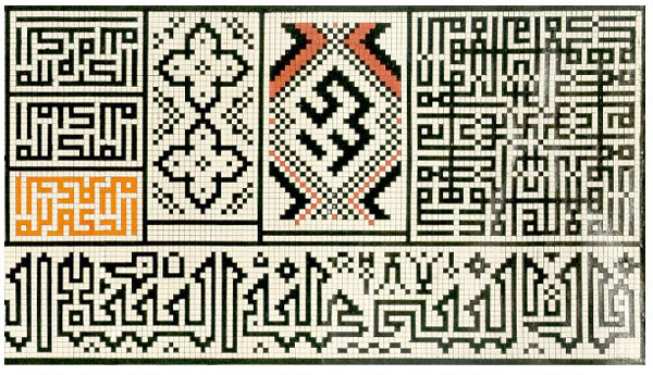
Thus we see versions of it that are adapted to the medium of ink on vellum, and others suitable for stone, mosaic or even brickwork (the world's first "pixel" fonts!), all recognizable as Kufic, but no two really identical. One variant, variously called Eastern Kufic or Broken Cursive, is slender with dynamic contrasts and diagonals, as if influenced by round styles but without losing Kufic traits. The one Kufic style that can really be pinned down is Square Kufic, and that because it's the most minimal possible form of Arabic script.


For 300 years, only Kufic was beautiful and monumental enough to write the Qur'an, and in the Maghrib (which means "sunset" or "West" in Arabic, i.e North Africa, the lands West of Egypt) it never lost its status but evolved a very particular cursive form, equally open to variation: the Maghribi script.

Rise of the Round Scripts
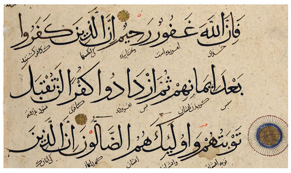
On the other hand, in the Mashriq ("sunrise" or "East", the Levant and Middle East), where the capitals of the Muslim world were always situated, vast amounts of administrative work meant a multitude of professional scribes, and that inevitably led to the rise of cursive or round scripts, quicker to write and more adapted to the smaller scale of letters and official documents.
Eventually attempts were made to elevate a round script to the status of Kufic, to make it worthy of sacred texts, particularly because paper appeared on the scene, and as a surface had properties quite different from vellum.
This was likely a gradual evolution, but folklore attributes to one man, Ibn Muqlah, a revolutionary invention, turning him into the legendary father of classical Islamic calligraphy. He is said to have invented a system of proportions so that all the letters are based on the height of the Alif, which itself is drawn in relation to the thickness of the pen used.
This created consistency and harmony in the script, and, just as the invention of glass blowing changed the course of glassmaking, this put calligraphy on a new track—no comparable advances have been made since (stop and think about this: this means khatt has not significantly evolved since the 10th century).
The Six Styles (Aqlam el-Sitta) of the classical tradition of Islamic calligraphy were created and perfected by Ibn Muqlah and his successors Ibn el-Bawwâb and Yaqût. They are the Naskh (basis for most Arabic fonts), Thuluth, Muhaqqaq, Rayhani, Riqa' and Tawqi' scripts.


This was the last contribution of that part of the world. After the fall of the Abbasids in 1258, the cultural and power centre of the Islamic world moved from Baghdad to Persia, where the Persian scripts were developed: Ta'liq, Nasta'liq (still the official script of Persian and Urdu), and Shikasteh. In 1517, it was the Ottomans' turn to inherit the Islamic world, and Turkish developments gave us the superstructured Diwani, and Ruq'a, on which today's handwriting across the Arab world is based. Other lesser scripts arose as far as Indonesia, but had no bearing on the history of khatt as a whole.


Comparison
The round scripts are called in Arabic al-khatt al-mansûb, which is "the script that conforms, that is regulated". That is the main difference with Kufic: the round scripts are formal. There are very specific rules to write each letter and connect them together, rules to be practiced till the hand follows them automatically.
This is to great effect, but at the expense of creative freedom. Indeed it was the mark of a great calligrapher that his work looked as if no human hand had been involved in it, let alone his own personality. This is why round scripts are simpler to teach (literally a no-brainer), but more demanding to master.
Kufic, in contrast, is tricky to teach and demands much participation and subtlety from the student, but as it is an approach rather than a visual formula, each student's work is then uniquely their own. As my teacher put it: "The return to Kufic is the return to the moment of first creation."
The Alphabet
You don't have to speak Arabic to work with khatt, and in fact this script is used for a number of languages including Persian and Urdu. But you do need a certain intimacy with the letters, so in this first tutorial, before starting to learn calligraphy or "beautiful writing", we need to learn writing itself.
The Arabic and Latin alphabets originate in the same, Phoenician alphabet. They therefore have similarities (by and large the letters match, for instance), but they are also very different in other respects. Here are the features to be aware of, that a Western user may find most challenging:
- Arabic is written from right to left.
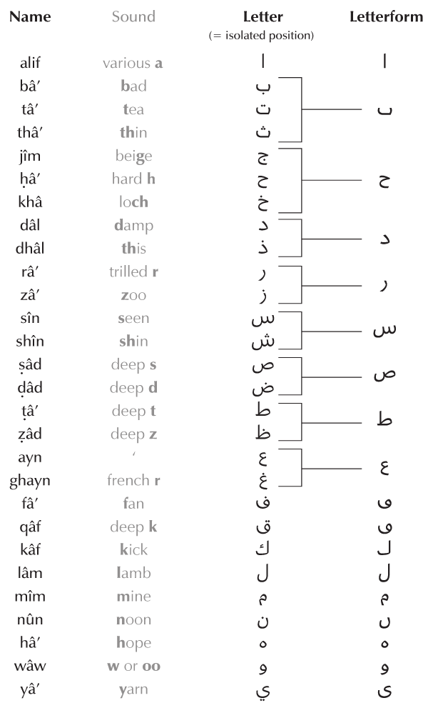
- There are 28 letters, but many of them are differentiated by dots, so there are in fact only 18 letterforms (morphemes) for the 28 sounds (phonemes). That's a lot less to learn when we look at the letters in detail.
- There are no vowels; vowel sounds are indicated by a system of diacritics I will detail in a later lesson. This is entirely optional! Most of the time we don't indicate these sounds at all. In khatt, they can be added for extra ornamental effect, or ignored altogether.
- Hyphenation does not exist. A word has to end on the same line it begins.
- Letters have no capital forms. Instead, their form changes depending on their position in the word (initial, medial, final, or isolated). This sounds more complicated than it actually is, because few letters change dramatically. Several only really have one form. The real point to pay attention to is whether they connect or not (see next point).
- In Latin scripts (for instance in English), letters are connected in handwriting or calligraphy, and disconnected when they are printed. In Arabic, it depends on the letters. All letters can connect on the right, but some letters won't connect on the left. A poetic tradition says these are angelic letters, because they are attached to their origin (God) but detached from what follows (the world). When I speak of non-connecting letters, I refer to those that don't connect on the left.


(Note: the pronunciation of some letters, such as jîm ج , can vary considerably across the Arab world. As we are only working with the written letter, this is of small consequence for our purposes.)
This next chart shows you the 18 letterforms only, in their final, medial and initial forms, and the non-connecting letters, marked with red crosses. The forms in black are the ones that are actually different, and the greyed-out ones are there just to give a complete picture.
If you look at them closely you'll notice they are not different forms of those letters at all, just a preview of how they look with a connection on the right, so it's safe to ignore them. But the black ones actually change altogether, and we're going to look at this "letter anatomy" closely in our next lesson.

Here's one last chart showing the original and more meaningful numeric sequence. Back in the day, as was the case for many alphabets, Arabic had no separate symbols for numbers (1234...): each letter had a numerical value and could be used to indicate a number. The numeric sequence reflects that order. It is known as abjad hawaz, a way of vocalizing (starting from the right!) and remembering it: Abjad Hawwaz Ḥuṭṭi Kalamon Sa'afaṣ Qarashat Thakhadh Ḍaẓhagh.

These "words" do not mean anything, but in esoteric symbolism, they are the names of eight angels supporting the divine Throne that surrounds all the worlds. This gives you a feel of the cosmic importance imparted on the alphabet, said here to surround and support the known universe.
Exercises
Today's exercises aim to simply make you familiar with these two basic behaviours of the letters in a word: how they change form and how they connect (Arabic speakers may skip them). So with no concerns about aesthetics, grab any paper and pen to practice the below. The answers for these two exercises are in the source file attached to this lesson: download and unzip (after you're done!).
1. Here is a list of words written with detached letters in their isolated form. Using the alphabet charts for reference, rewrite the words properly connected, with the letters in the correct form for their position (they are in the correct order).

2. Pushing it a notch: transcribe the following into Arabic. Remember the letters need to be rearranged from right to left.

3. I would also recommend an image search of "Kufi calligraphy" to familiarize your eye with its various forms. If you can recognize some of the letters above in the results that come up, kudos, but if not, it's OK. We're going to look at them really closely in our next lesson.


No comments:
Post a Comment